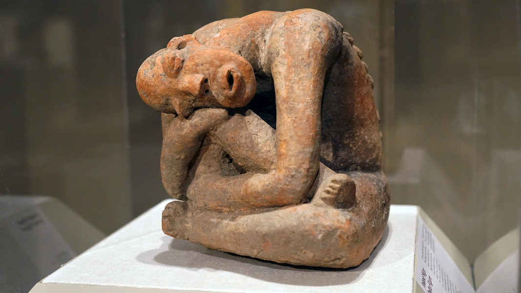
Seated Figure, terracotta, 13th century, Mali, Inland Niger Delta region, Djenné peoples, 25/4 x 29.9 cm (The Metropolitan Museum of Art)
Why does a work of art look the way it does? Who made it and why? What does it mean? These questions and others like them lie at the heart of art historical inquiry. Art historians use various types of analysis to provide answers. These have varied over time and continue to evolve, but in general, three categories can be distinguished. In the essays and videos on Smarthistory, different types of analysis are used, often without identifying them explicitly. If you become familiar with the three categories below, you will be able to recognize them.
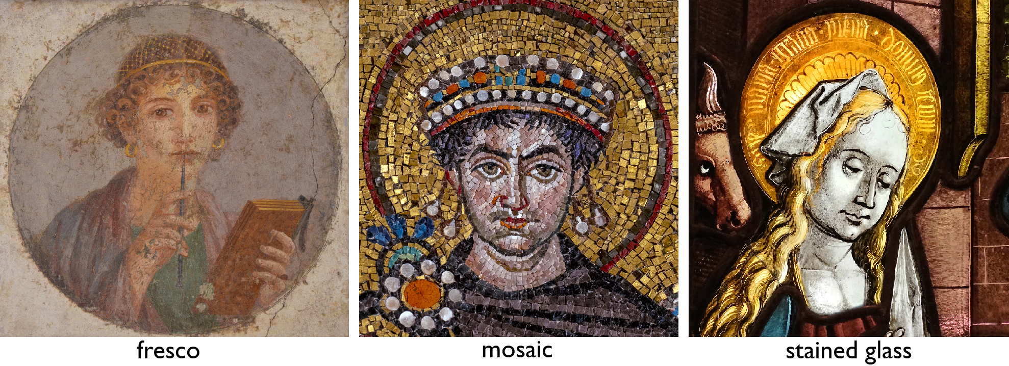
Left: Woman with wax tablets and stylus, c. 50 C.E., fresco (National Archaeological Museum, Naples; photo: Meidosensei, CC BY-SA 2.0); center: Justinian (detail), Justinian and Attendants, mosaic, north wall of the apse, San Vitale, Ravenna, Italy, c. 547 (photo: Steven Zucker, CC BY-NC-SA 2.0); right: Circle of Peter Hemmel von Andlau (Strassburger Werkstattgemeinschaft), Adoration of the Magi (detail), 1507, Munich, Germany, pot metal and colorless glass, vitreous paint, and silver stain, 72.4 x 45.7 cm (Cloisters, The Metropolitan Museum of Art; photo: Steven Zucker, CC BY-NC-SA 2.0)
Art as physical object
Oil and pigments on canvas, carved marble, woven fibers, a concrete dome—most works of art and architecture are physical things. As such, a fundamental determinant of the way they look is the material of which they are made. In architecture, the word used for this is simply materials. In art, the term medium (plural: media) is also used.
Materials have specific properties that dictate the ways they can be manipulated and the effects they can produce. For example, marble will crack under its own weight if not properly balanced and supported, which imposes limits on the sculptural forms or architectural designs that can be created with it. Fresco painting, stained glass, and mosaic are all capable of creating breathtaking images, but their visual qualities differ significantly due to the distinct physical properties and working methods of each medium. This latter aspect—the way a medium is worked or used—is called technique. Together, materials and technique determine basic visual features and the parameters within which an artist or architect must work.
Learning to recognize specific media and techniques and how they have been used historically are fundamental art historical skills. Not only do they allow you to understand the logic behind specific visual qualities, but they may also help identify when and where a work was made since certain media and techniques are characteristic of specific periods and places.
Conservation
Technological advances have led to new methods of analyzing materials and techniques. Today this research is carried out primarily by art conservators. Because art and architecture, like all physical things, are subject to the corrosive effects of time and environment, conservation science is a crucial field. Training in art conservation typically involves coursework in chemistry as well as the practice and history of art.
While the main job of conservators is preservation, their investigative techniques can also benefit art historians. Technologies such as X-radiography, ultraviolet illumination, and infrared reflectography can reveal features of an object invisible to the human eye, such as the inside of a bronze statue, changes made to a painting, or drawing under a painted surface. X-ray fluorescence can identify the pigments in paint or the composition of metals by their chemical profiles. Dendrochronology can establish the earliest date a wooden object could have been made based on tree ring growth patterns. Analysis of materials and techniques using methods such as these can help art historians answer questions about when, where, how, or by whom, a work was made.
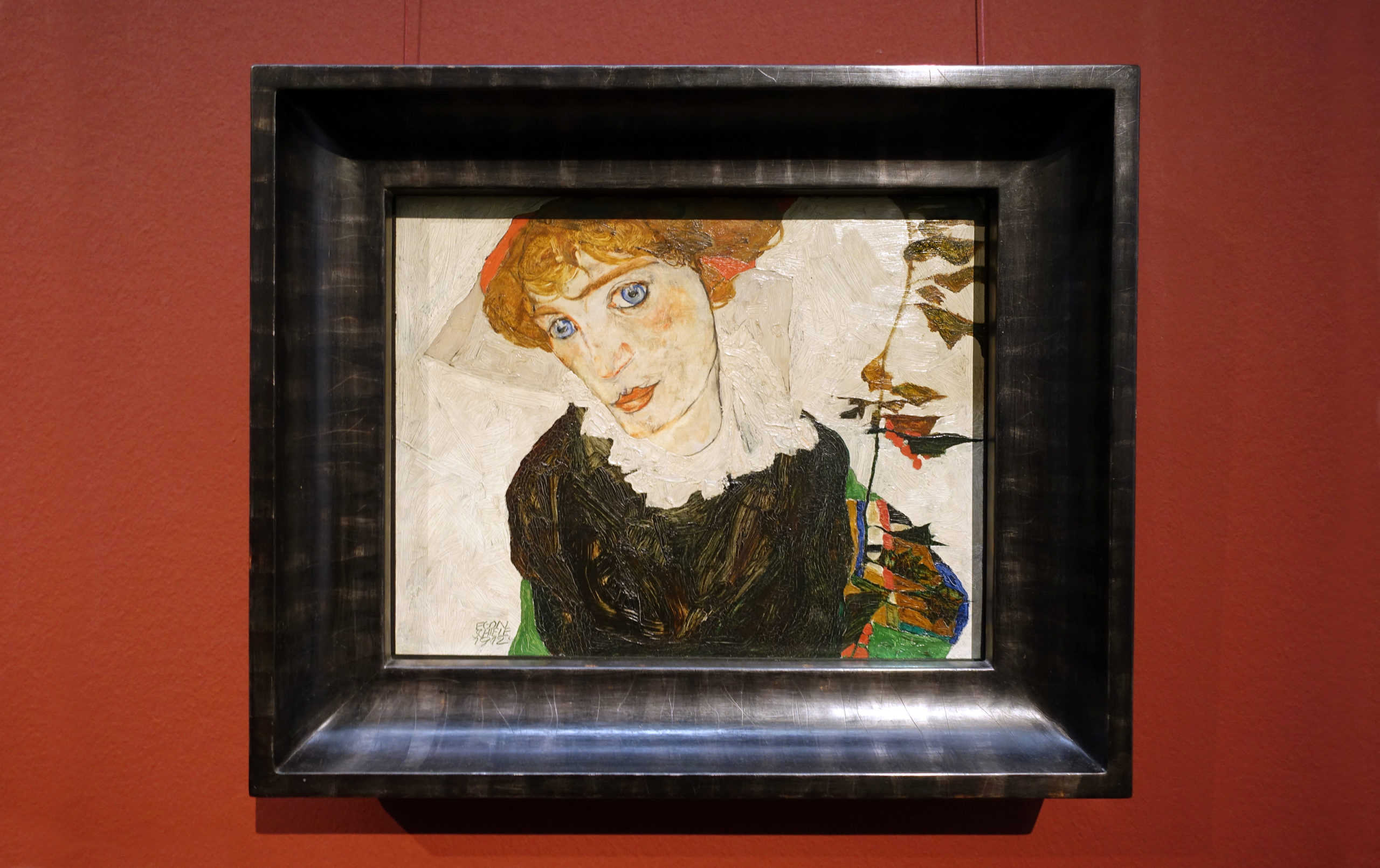
Egon Schiele, Portrait of Wally Neuzil, 1912, oil on panel, 32 x 39.8 cm (Leopold Museum, Vienna; photo: Steven Zucker, CC BY-NC-SA 2.0)
Art as visual experience
Most art is visually compelling. While materials and technique determine the range of what is possible, the final appearance of a work is the product of numerous additional choices made by the artist. An artist painting a portrait of a woman in oil on canvas must decide on the size and shape of the canvas, the scale of the woman and where to place her, and the types of forms, lines, colors, and brushstrokes to use in representing the sitter and her surroundings. In a compelling work of art, myriad variables such as these and others come together to create an engaging visual experience.
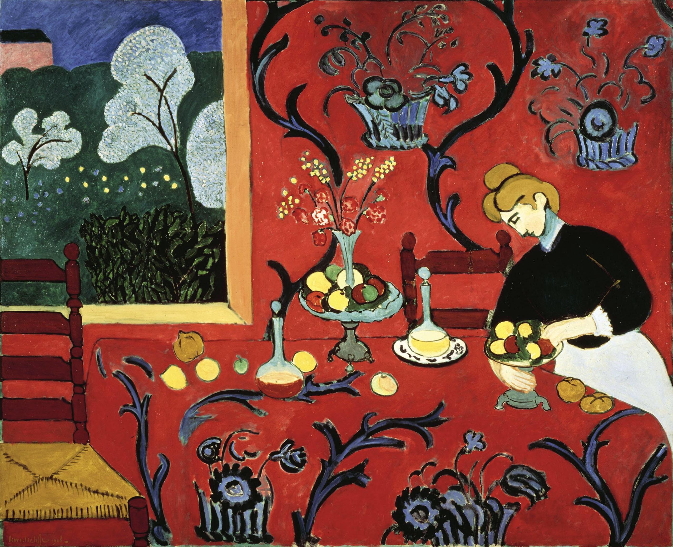
Visual (formal) analysis
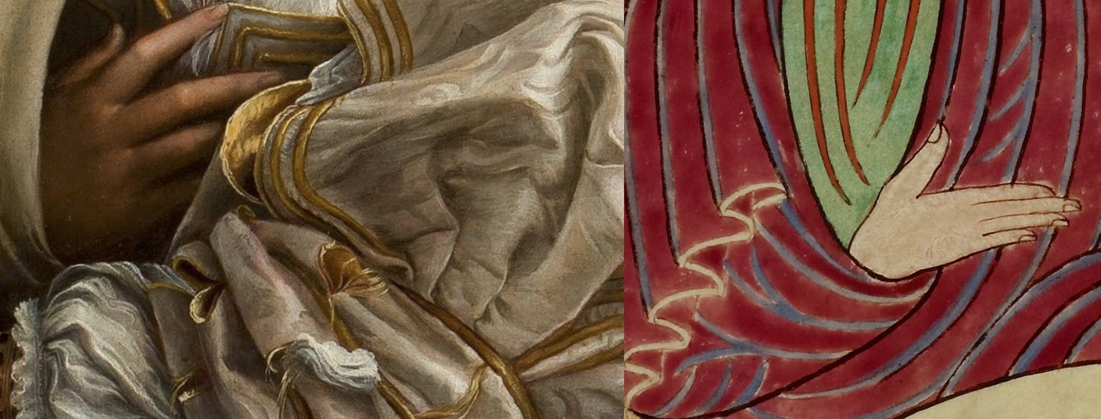
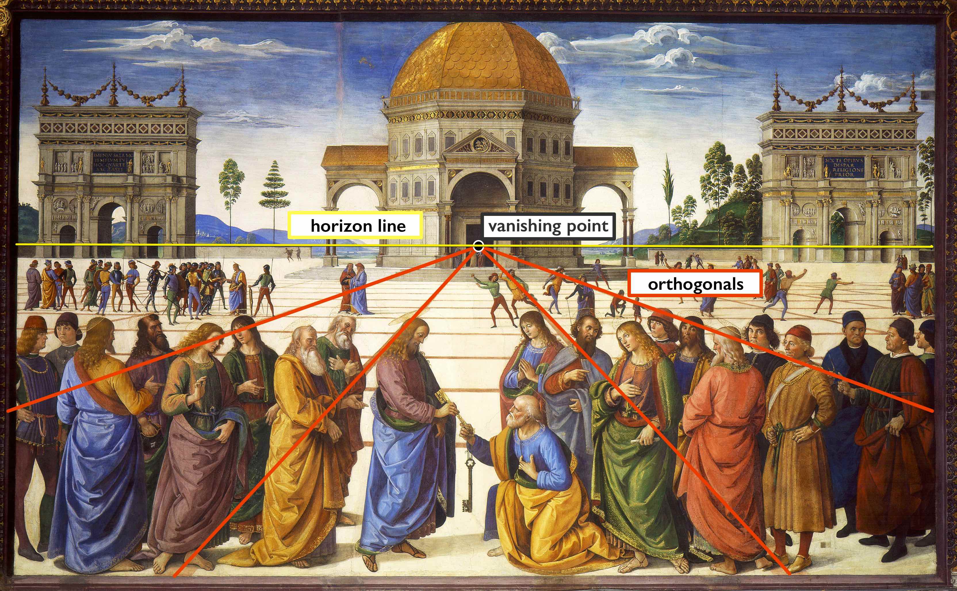
Art historians use visual analysis to describe and understand this experience. Often called formal analysis because it focuses on form rather than subject matter or historical context, this typically consists of two parts: description of the visual features of a work and analysis of their effects. To describe visual properties systematically, art historians rely on an established set of terms and concepts. These include characteristics such as format, scale, composition, and viewpoint; treatment of the human figure and space; and the use of form, line, color, light, and texture.
In describing visual qualities, formal analysis usually identifies certain features as contributing to the overall impression of the work. For example, a prominent linear form might suggest strength if straight and vertical, grace or sensuality if sinuous, or stability and calm if long and horizontal. Sharp contrasts in light and dark may make an image feel bold and dramatic whereas subdued lighting might suggest gentleness or intimacy. In the past, formal analysis assumed there was some elementary level of universality in the human response to visual form and tried to describe these effects. Today, the method is understood as more subjective, but still valued as a critical exercise and means of analyzing visual experience, especially in introductory art history courses.
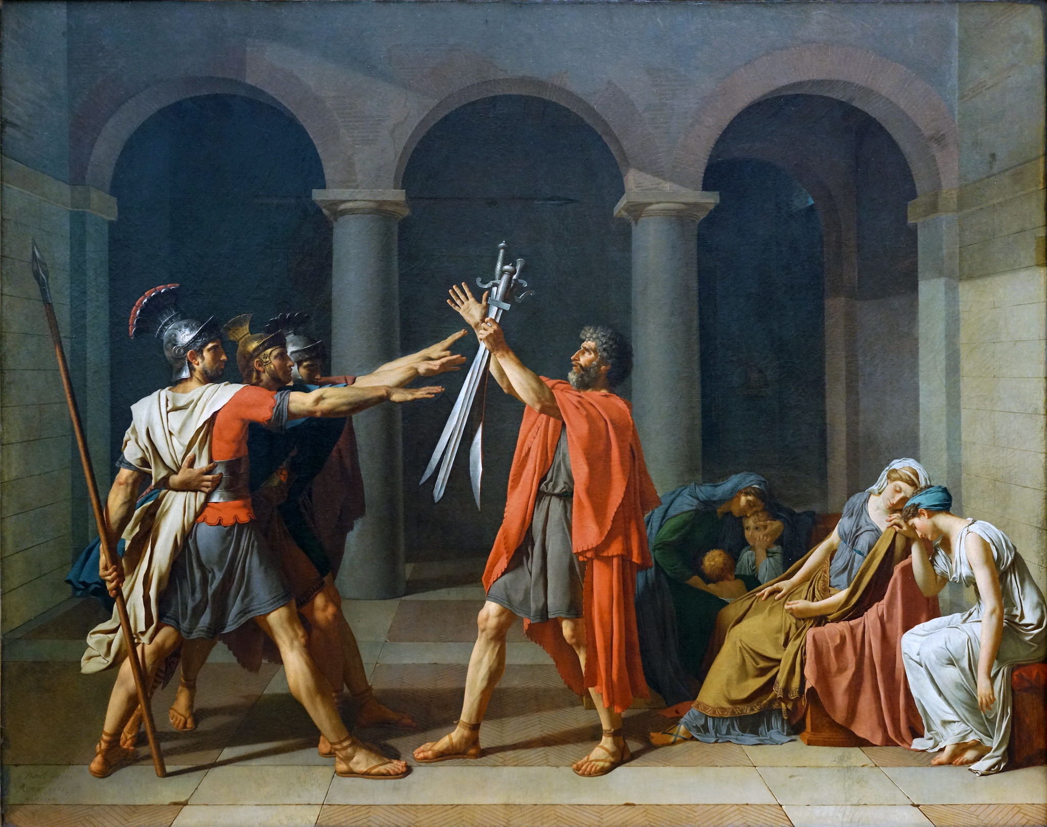
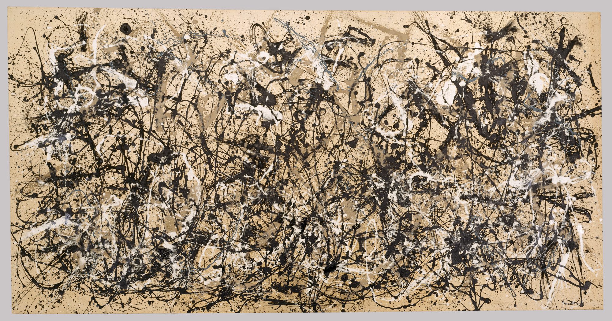
Jacques-Louis David, Oath of the Horatii, 1784, oil on canvas, 3.3 x 4.25 m, painted in Rome, exhibited at the salon of 1785 (Musée du Louvre; photo: Steven Zucker, CC BY-NC-SA 2.0)
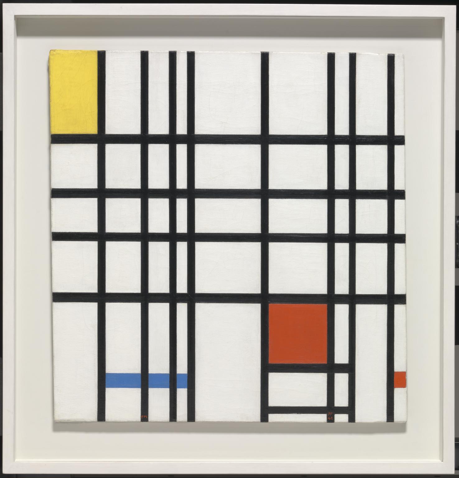
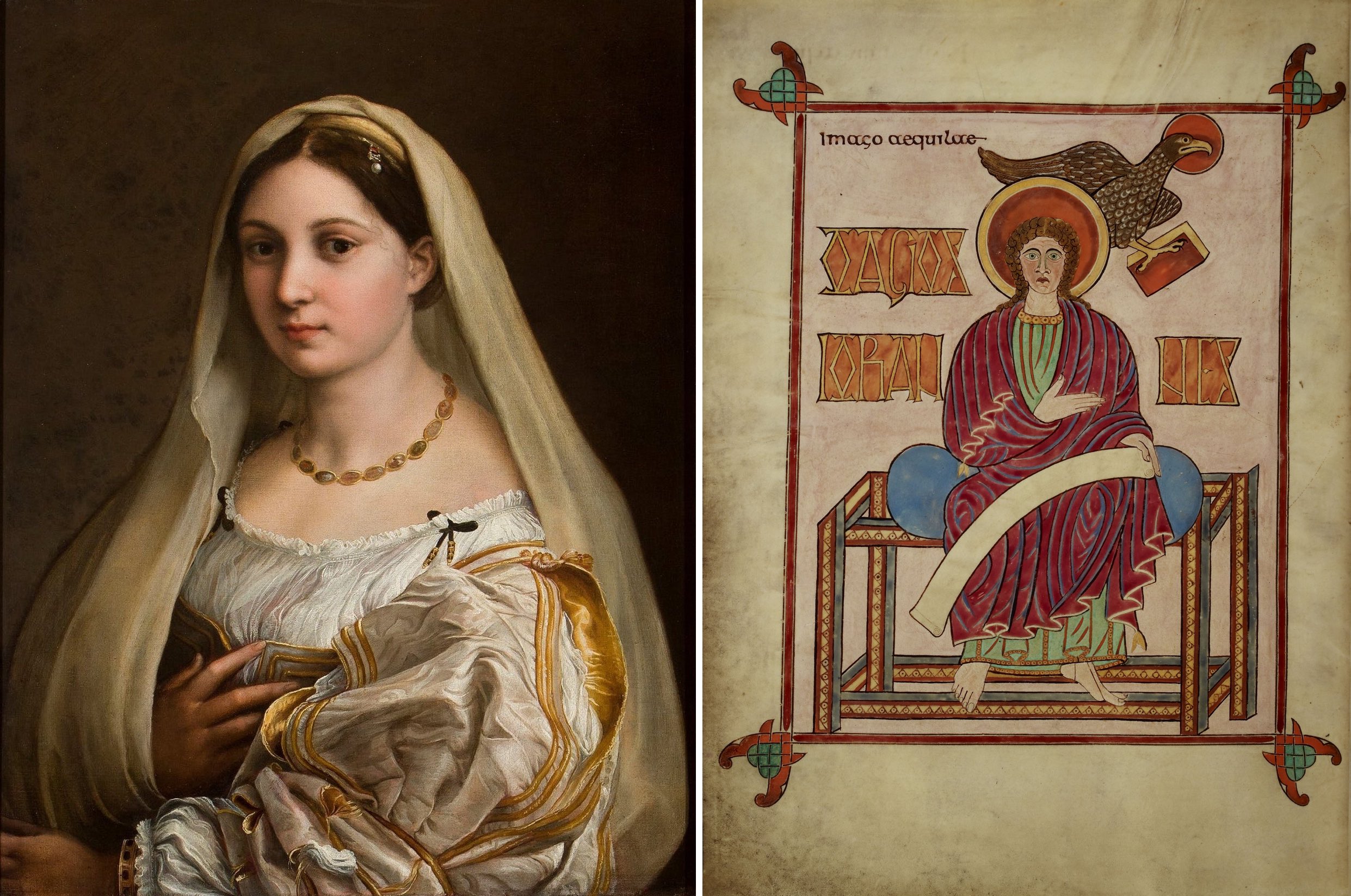
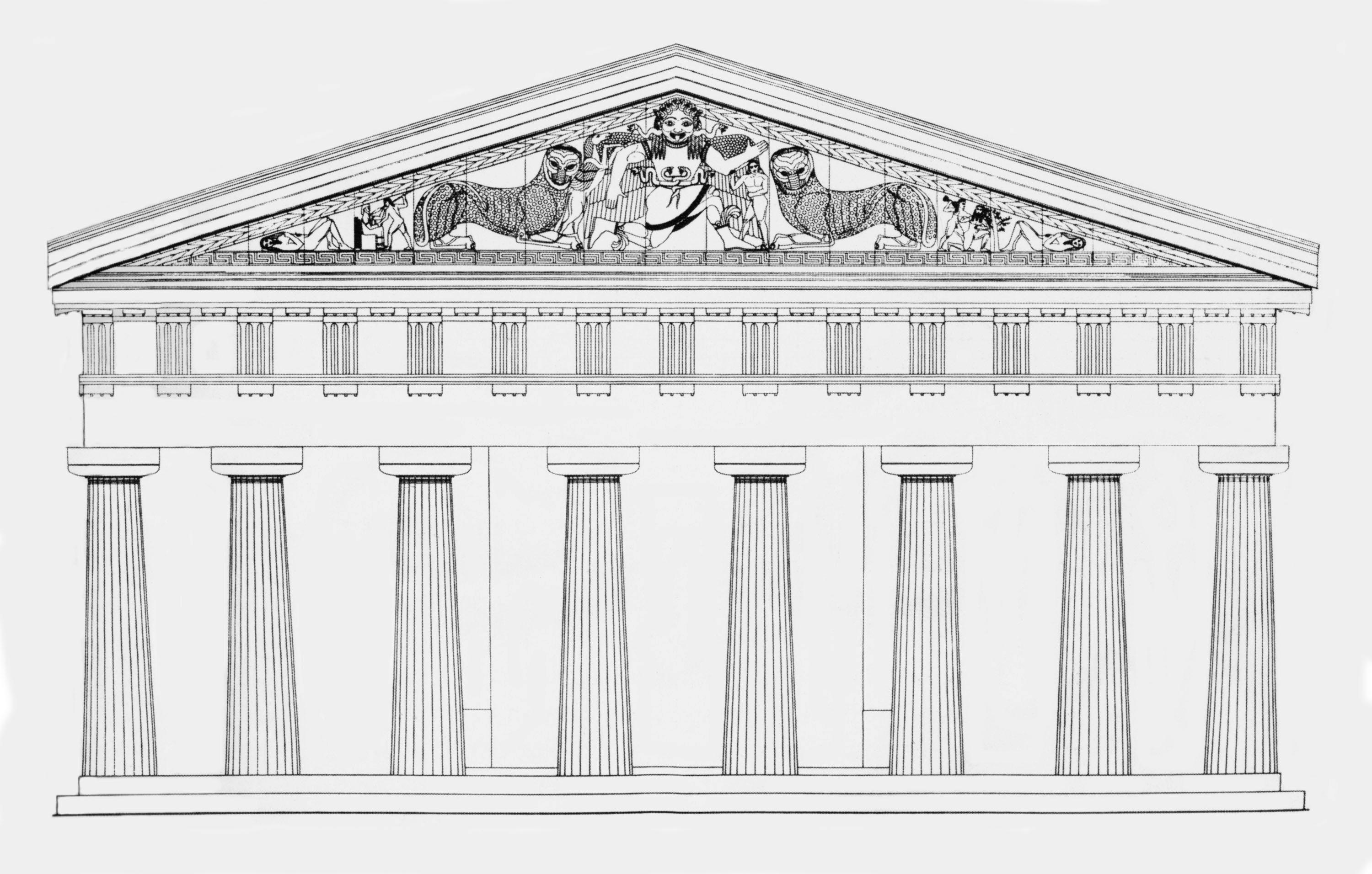
Style
Formal analysis is a powerful tool for appreciating art. Armed with it, you can analyze any work based simply on the experience of looking at it. But the method is also important for understanding art in its historical context. This is because the visual properties of works made by an individual artist or, more generally, by artists working in the same time and place, typically have common features. Art historians call these shared characteristics style. As art historian James Elkins elegantly phrased it, style is “a coherence of qualities in periods or people.” [1] This may include consistency in things like medium, function, and subject matter, but when art historians use the term style, they primarily mean formal characteristics.
Style varies by time and place, so like medium and technique, it can be used to determine the origin of a work of art. Because of its complexity, style is a far more specific indicator than materials and technique alone. Early art historians used stylistic analysis to categorize the vast legacy of undocumented art, assigning works to cultures, artistic circles, or individual artists based on their formal qualities. Today, stylistic analysis continues to be used to establish origins when unknown works are discovered or previous attributions revised.
In addition to helping categorize individual works, style has shaped the narratives told by art historians in fundamental ways. Until the mid-20th century, most histories of art focused on tracing stylistic development and change. As a result, many of the period divisions traditionally used for Western art are based on style. Some examples are Geometric, Orientalizing, Archaic, and Classical in ancient Greece, Romanesque and Gothic in Medieval Europe, and the Early, High, and Late Renaissance. Today style is only one of many aspects of art that interest art historians, but the power of tradition has ensured that style-based period divisions and labels remain widely used. Likewise, familiarity with the style of specific periods, places, and artists is still considered fundamental art historical knowledge and often remains the focus of introductory art history textbooks and courses.
Art as cultural artifact
While understanding the physical properties and visual experience of art is important, today most art historical research focuses on the significance of works as cultural artifacts. This category of analysis is characterized by a variety of approaches, but all share the basic objective of examining art in relation to its historical context. Most often, this is the time and place in which a work was created—typically we want to know why and by whom it was made and how it originally functioned. But since works of art and architecture often survive for centuries, art historians may also study a work’s cultural significance at later historical moments.

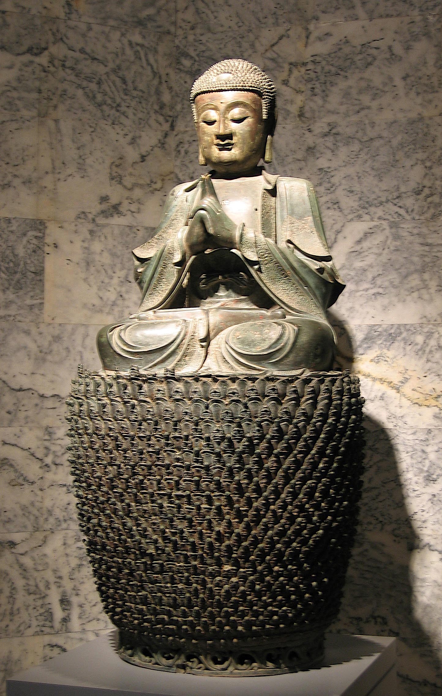
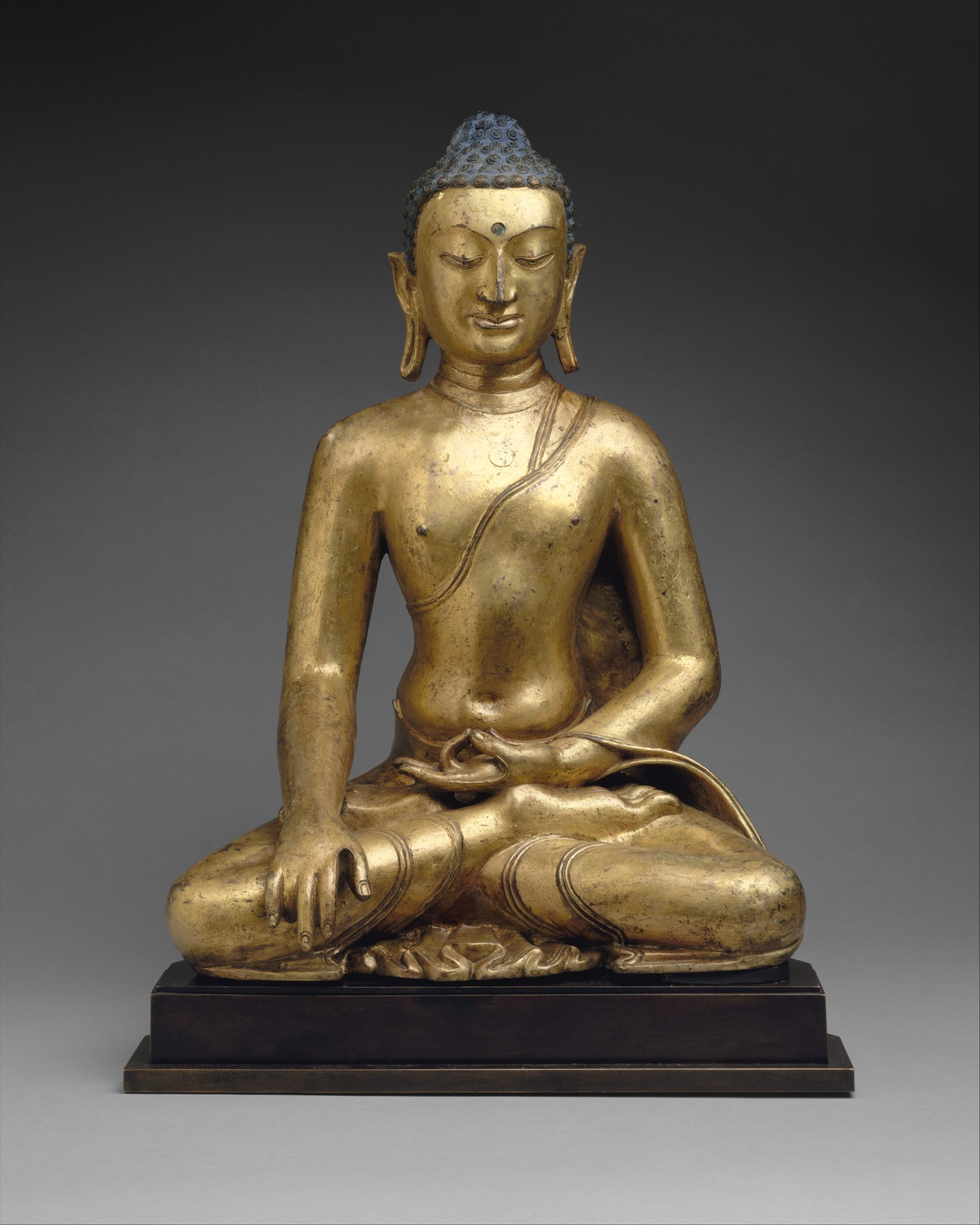
Buddha Shakyamuni or Akshobhya, the Buddha of the East, 11th–12th century, Tibet, gilt copper, 58 cm high (The Metropolitan Museum of Art)
Subject matter / iconography
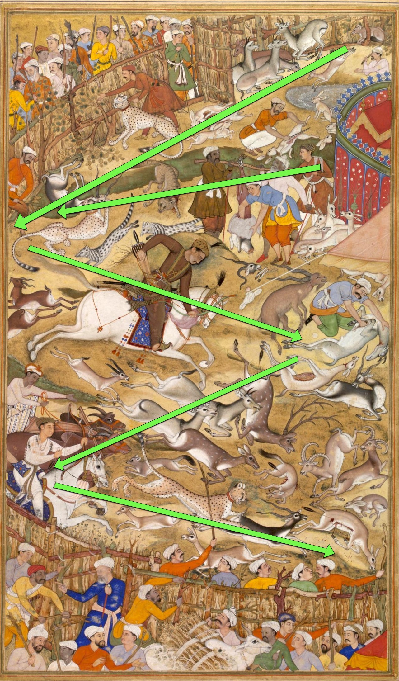
One of the most basic types of contextual analysis is the interpretation of subject matter. Much art is representational (i.e., it creates a likeness of something), and naturally we want to understand what is shown and why. Art historians call the subject matter of images iconography. Iconographic analysis is the interpretation of its meaning. In many cases, such as an image of the crucified Christ or seated Buddha, identifying the subject presents few problems. When the iconography is obscure or treated in an unusual way, art historians try to understand it by studying the historical context in which the image was made, typically through comparison with texts and other imagery from the time. With challenging images, scholars may disagree on which contextual materials are relevant, resulting in conflicting interpretations. For many complex or enigmatic works, the meanings of the subject matter continue to be debated and reinterpreted today.
Function
Another common aspect of art investigated through contextual analysis is function. Historically, many works of art and nearly all architecture were intended to serve some purpose beyond the aesthetic. Understanding function is crucial because it usually plays a role in determining many features, including iconography, materials, format, and aspects of style. At the most basic level, art historians analyze function by identifying types—an altarpiece, portrait, Book of Hours, tomb, palace, etc. Studying the history and use of a given type provides a context for understanding specific examples.
Analysis of function becomes more complex when the personal motivations of the people responsible for making a work are considered. For much of history, this includes not only artists but also the patrons who commissioned works and in some cases, advisors acting on the patron’s behalf. When such agents can be identified, definitively or hypothetically, their motivations become potential contexts for understanding purpose and appearance.

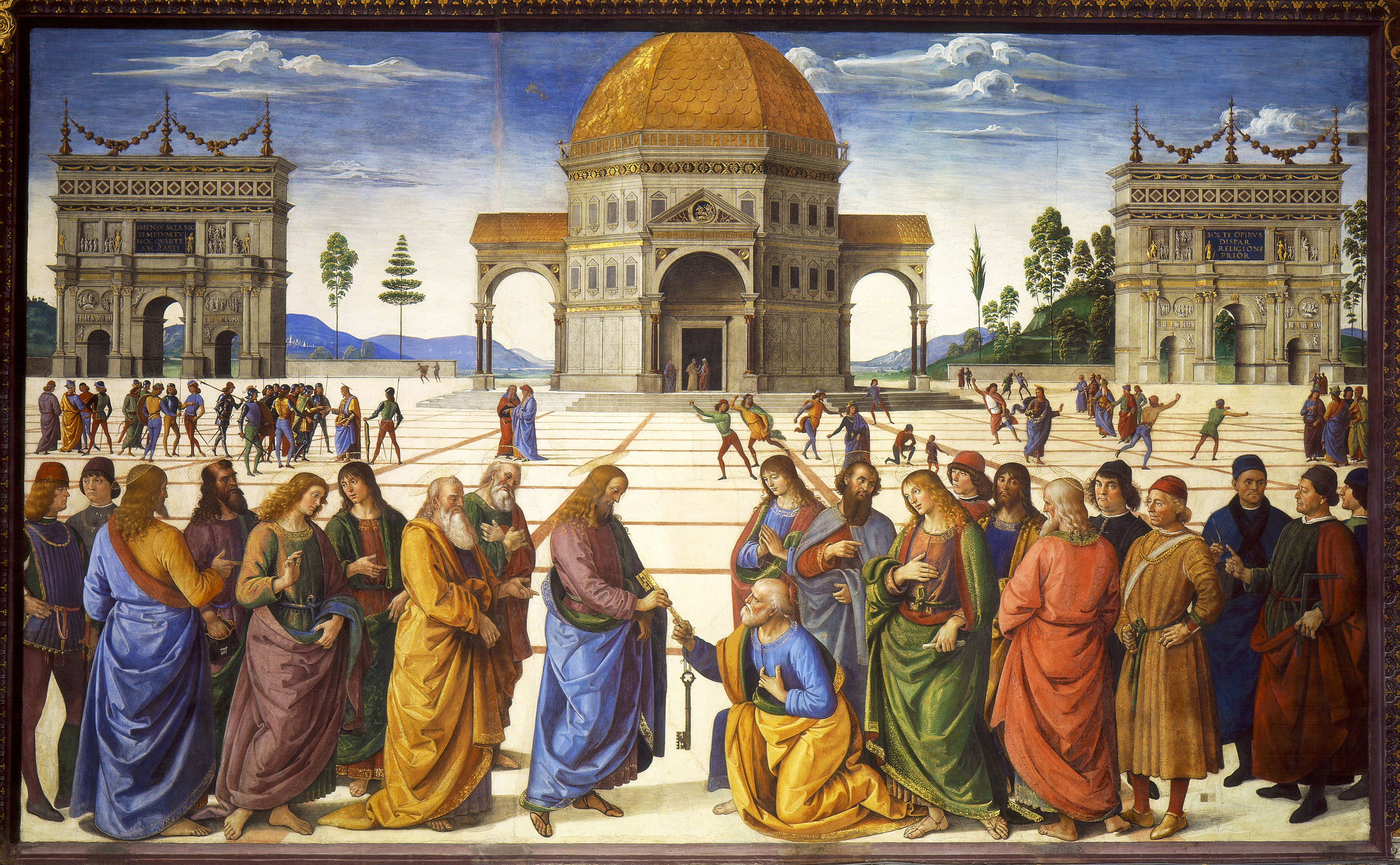
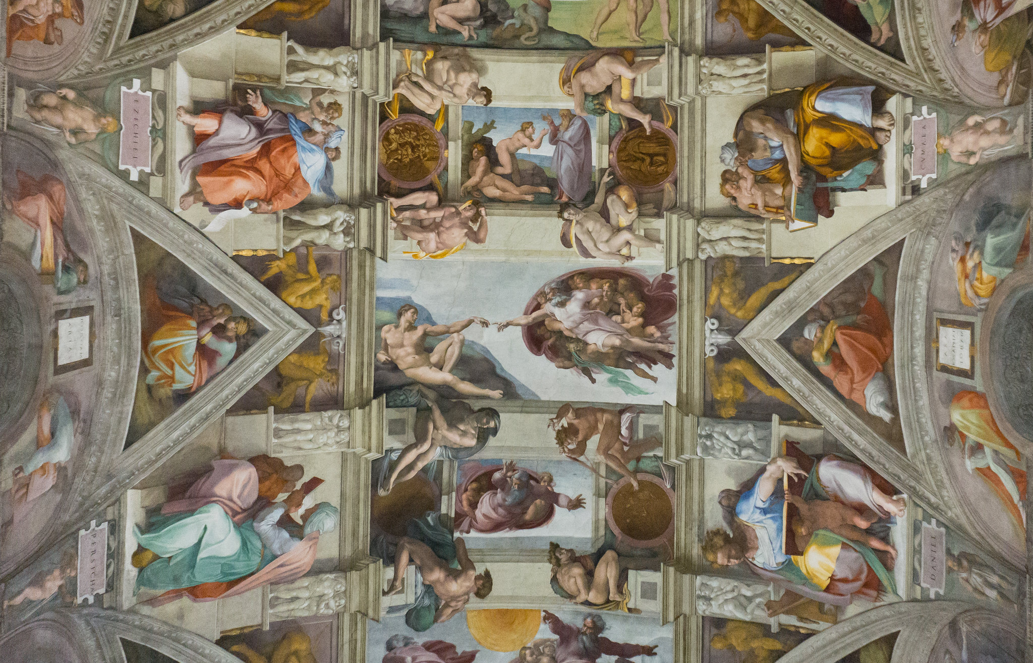
Michelangelo, Ceiling of the Sistine Chapel (detail), 1508–12, Vatican, Rome (photo: Kent G Becker, CC BY-NC-ND 2.0)
With complex works, this can soon raise interpretive quandaries. Take, for example, Michelangelo’s famous frescos on the ceiling of the Sistine Chapel. Are these highly original paintings best understood in relation to the function of the chapel (a key ritual site in the Vatican palace), or the concerns of the painter, Michelangelo, or of the patron, Pope Julius II, or of one or more of the Julius’s advisors at the papal court? The answer is likely some combination of these, but the contextual materials relevant to each are so vast and diverse that there is no one way to interpret them.
Thinking critically
This raises a final point about analyzing the meaning of art and architecture as cultural artifacts. While art historians rely on facts as much as possible and seek to interpret works in ways that are historically plausible, we recognize that subjectivity is inescapable. As discussed in “What is art history?,” we interpret the past in ways that make sense in the present. Today, art historians continue to ask traditional questions like those noted above, but they also ask new ones inspired by social developments such as feminism, globalism, multiculturalism, and identity politics.
So, as you read, watch, and listen, try to recognize the approaches being used and to think critically about them. Is the speaker or writer talking about the work as a physical object, visual experience, or cultural artifact? (Often it will be some combination.) What contexts are being used to explain meaning? Which contexts are not considered? This may leave you with as many questions as answers, but that is good. You are here not only to gain knowledge, but also to develop a curiosity about the world and the ability to think critically about it.
Notes:
[1] James Elkins, “Style,” Grove Art Online, Oxford Art Online (Oxford University Press, accessed August 15, 2017).
Additional resources
Read a chapter in our textbook, Reframing Art History, about learning to look and think critically.
Read a chapter in our textbook, Reframing Art History, about close looking and approaches to art.
Cite this page as: Dr. Robert Glass, “Introduction to art historical analysis,” in Smarthistory, October 28, 2017, accessed December 27, 2023, https://smarthistory.org/introduction-to-art-historical-analysis/.