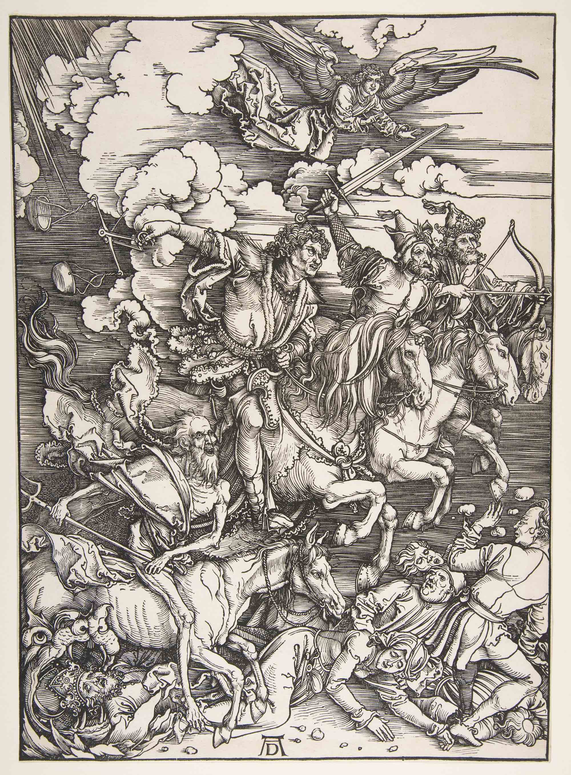
Albrecht Dürer, The Four Horsemen, from The Apocalypse,1498, woodcut, 38.7 x 27.9 cm (The Metropolitan Museum of Art)
Line is the most basic visual element. Lines can be used to define shapes and figures, but also to indicate motion, emotion, and other elements.
Detail, Albrecht Dürer, The Four Horsemen, from The Apocalypse,1498, woodcut, 38.7 x 27.9 cm (The Metropolitan Museum of Art)
Contour lines and hatching
In a woodblock print of the Four Horsemen of the Apocalypse by Albrecht Dürer, contour lines — lines that define shapes — are used to mark the outside of all of the elements of the image.
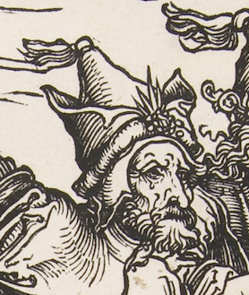
The outline of the hat on one of the horsemen, for example, is clearly made by a few black contour lines. This simple device is so effective that it is hard to remember that there is no hat here, only a few black marks on a white page.
Note, though, that lines are also used to show shading – the shadows caused when light hits one side of an object, leaving the other in shadow. On the hat, for example, the closely spaced lines, called hatching, show that the left side of his hat is in a shadow. This also helps the hat to look more three-dimensional, giving it a sense of form.
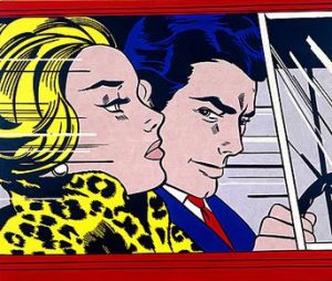
Roy Lichtenstein, In the Car, 1963, oil and magna on canvas, 172.00 x 203.50 cm (National Galleries, Scotland, © Estate of Roy Lichtenstein/DACS 2018)
Contour lines outline all the figures and forms in the image, creating the illusion of shading and form. In addition, there are horizontal lines in the background. While these create shading, they also help create the sense that the riders are moving rapidly from left to right. Motion lines may be familiar to you from comic strips, but they appear in all sorts of work.
Organic and inorganic (geometric) lines
In the Dürer print, we can also divide the lines into organic and inorganic (or geometric) lines (see the section on shape for more on organic and inorganic). Organic lines are loose, curving lines like those found in nature. In the Dürer print, the lines of the horses’ manes and tails, the figures’ hair, and the ruffled clouds are all organic. Inorganic lines are generally straight or perfectly curving lines, like those found in geometry. In this image, most of the lines are organic, but the horizontal lines in the background are inorganic.
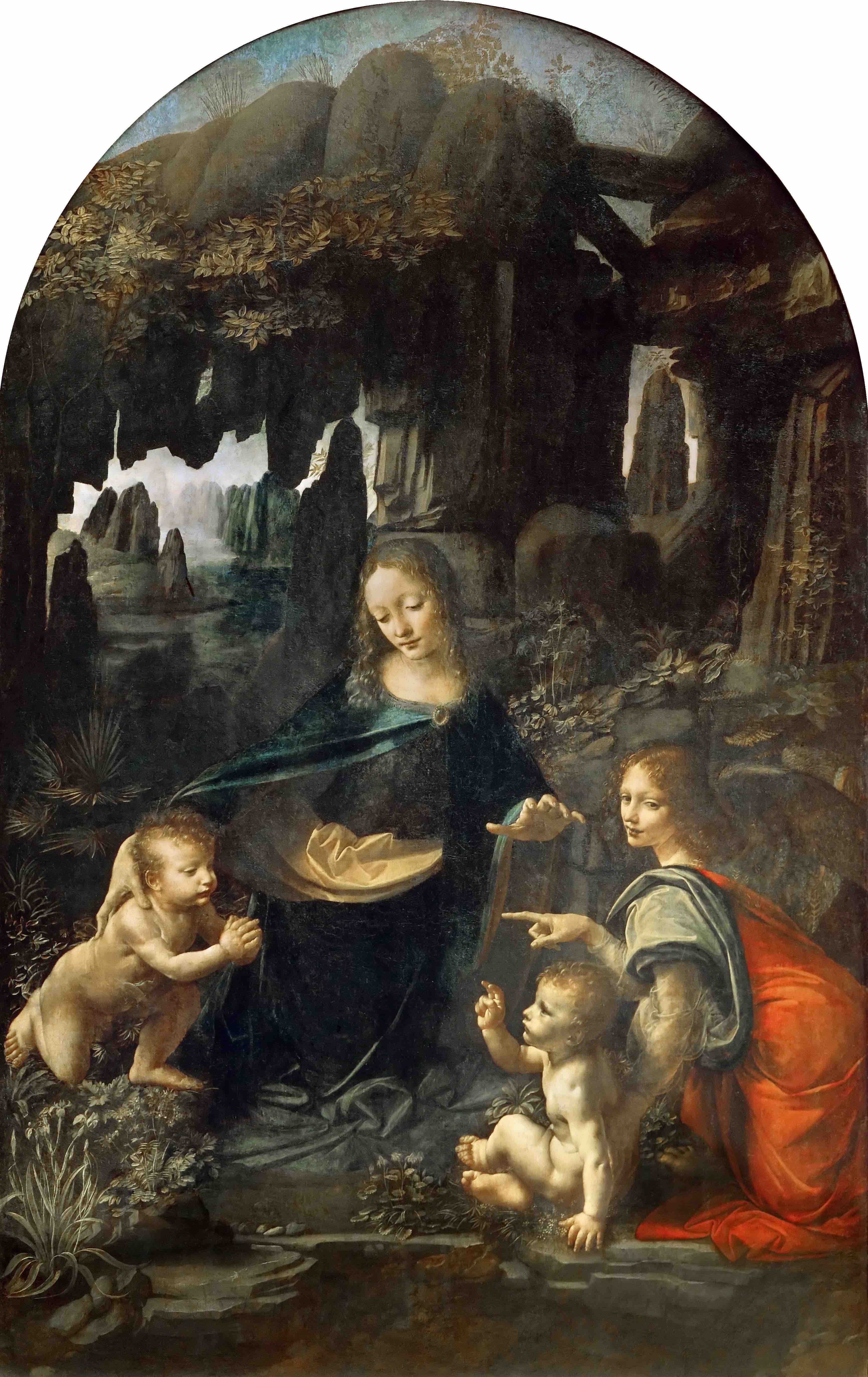
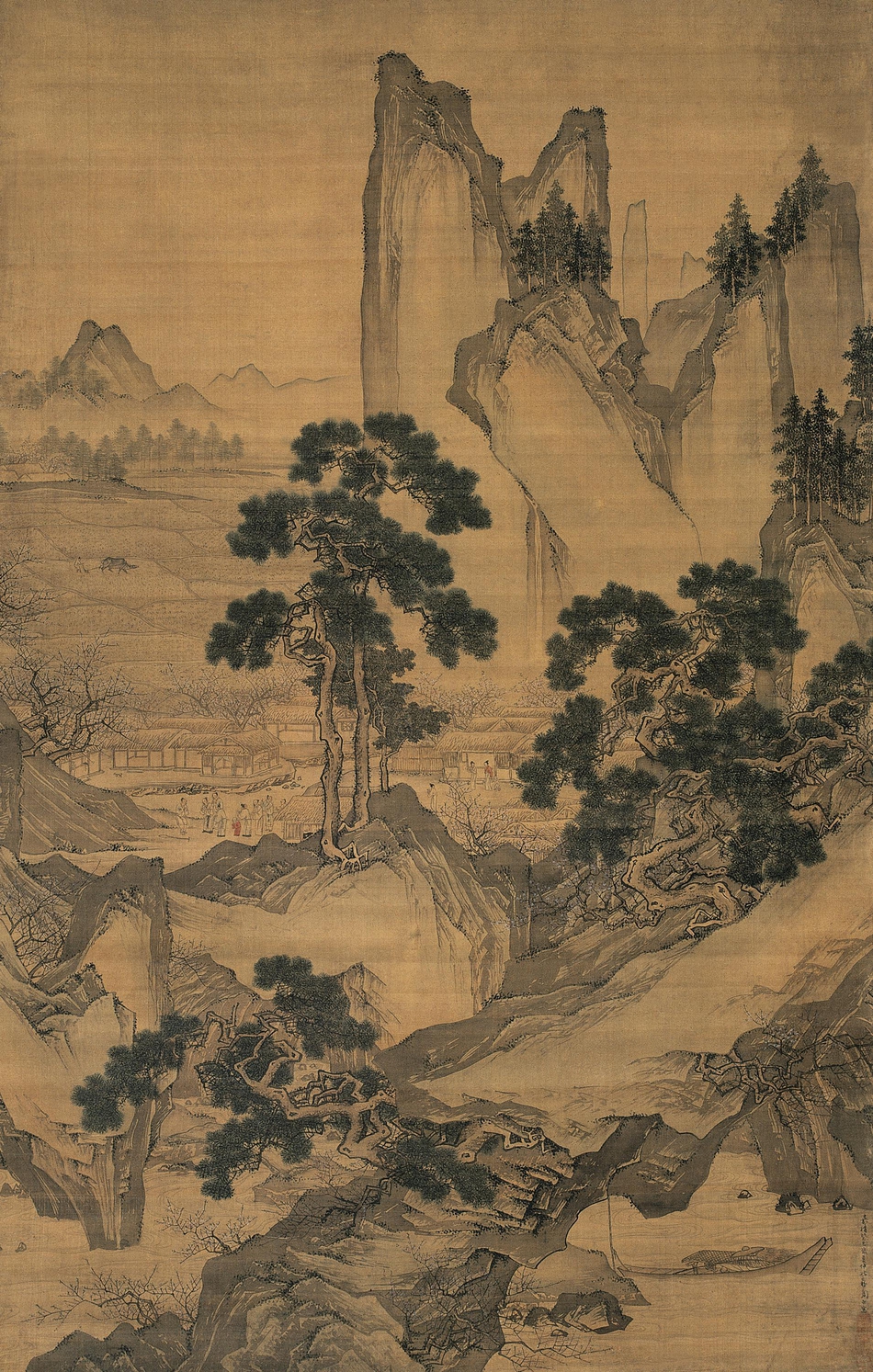
Leonardo da Vinci, The Virgin of the Rocks, c. 1483-86, oil on panel, 199 x 122 cm (Louvre, Paris)
Implied lines
We can also look for implied lines. These are not actually drawn, but we can connect the dots (literally or figuratively) to create the lines in our minds. Leonardo da Vinci’s Virgin of the Rocks contains wonderful examples of implied lines.
Here, the implied lines are sight lines, which guide us throughout the image. These help us know where to look, and show us what is important in the painting. Follow the gazes of the figures as they look and point at one another. The angel in the red cape to the right looks out at us, and then points at the infant John the Baptist, at the left. He looks at the infant Jesus, who in turn looks back again at him. Above, Mary looks down at Jesus, and also gestures toward him with her hand.
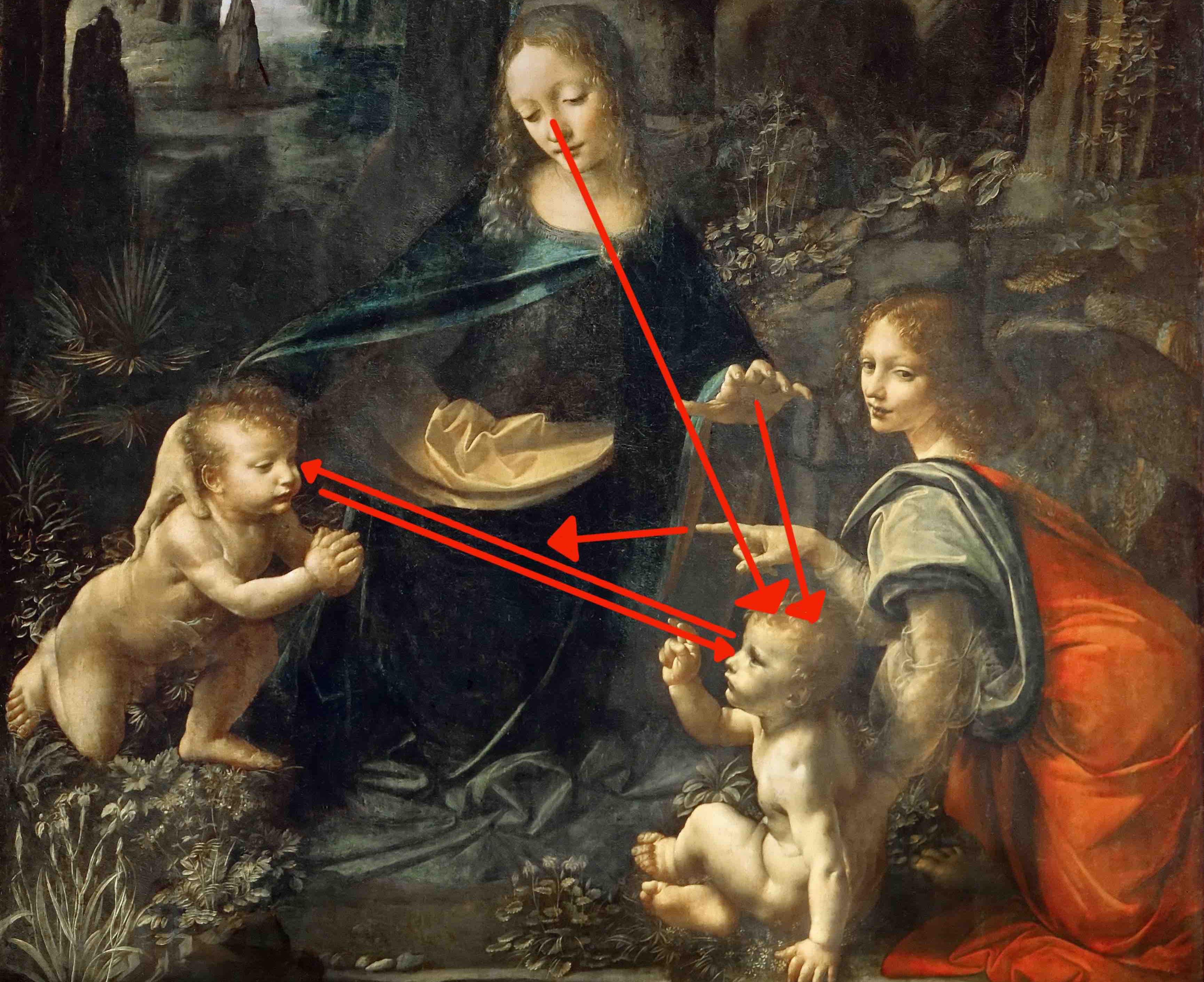
Detail with implied lines, Leonardo da Vinci, The Virgin of the Rocks, c. 1483-86, oil on panel, 199 x 122 cm (Louvre, Paris)
Basically, once we make it into the space of the painting by meeting the gaze of the angel, we become locked in a cycle of movement between the holy figures, guided by their sight lines.